
Tags
In my last job, I was a frequent flyer. Each week I flew between 2 or 3 countries, briefly returning for 24 hours on the weekend to get a change of clothes. My favourite airlines were Cathay Pacific, Emirates and Singapore Air. Now, unless you have been living in a cave, you’d be well aware of the recent news story of how United Airlines removed David Dao from an aircraft. I wondered how that incident had affected United’s brand value, and being a data scientist I decided to do sentiment analysis of United versus my favourite airlines.
Way back on 4th July 2015, almost two years ago, I wrote a blog entitled Tutorial: Using R and Twitter to Analyse Consumer Sentiment. Even though that blog post is one of my earliest, it continues to be the most popular, attracting just as many readers per day as when I first wrote it.
Since the sentiment package, upon which that blog was based, is no longer supported by CRAN, and many readers have problems with the manual and technical process of installing an obsolete package from an archive, I have written a new blog using a different, live CRAN package. The syuzhet package was published only several weeks ago, and offers a range of different sentiment analysis models. So I’ve started to try it out.
I have collected tweets for 4 airlines:
- Cathay Pacific
- Emirates
- Singapore Air
- United Airlines
The tweet data starts at 01-Jan-2015 and go up to mid-April 2017.
Step 1: Load the tweets and load the relevant packages
library(foreign)
library(syuzhet)
library(lubridate)
library(plyr)
library(ggplot2)
library(tm)
library(wordcloud)

# get the data for the tweets
dataURL = 'https://s3-ap-southeast-1.amazonaws.com/colinpriest/tweets.zip'
if (! file.exists('tweets.zip')) download.file(dataURL, 'tweets.zip')
if (! file.exists('tweets.dbf')) unzip('tweets.zip')
tweets = read.dbf('tweets.dbf', as.is = TRUE)
I’ve stored the tweets in a dbf file and zipped it. The zip file is 68MB in size, and the dbf file is 353MB. The code shown above downloads the zip file, extracts the dbf and then reads the dbf file into a data.frame.
Step 2: Do Sentiment Scoring using the syuzhet package
# function to get various sentiment scores, using the syuzhet package
scoreSentiment = function(tab)
{
 tab$syuzhet = get_sentiment(tab$Text, method="syuzhet")
 tab$bing = get_sentiment(tab$Text, method="bing")
 tab$afinn = get_sentiment(tab$Text, method="afinn")
 tab$nrc = get_sentiment(tab$Text, method="nrc")
 emotions = get_nrc_sentiment(tab$Text)
 n = names(emotions)
 for (nn in n) tab[, nn] = emotions[nn]
 return(tab)
}

# get the sentiment scores for the tweets
tweets = scoreSentiment(tweets)
tweets = tweets[tweets$TimeStamp < as.Date('19-04-2017', format = '%d-%m-%Y'),]
The syuzhet package offers a few different algorithms, each taking a different approach to sentiment scoring. It also does emotion scoring based upon the nrc algorithm. The code above calculates scores using the syuzhet, bing, afinn and nrc algorithms, adding columns with the scores from each algorithm.
Step 3: Visualise the Sentiment Scores
# function to find the week in which a date occurs
round_weeks <- function(x)
{
require(data.table)
dt = data.table(i = 1:length(x), day = x, weekday = weekdays(x))
offset = data.table(weekday = c('Sunday', 'Monday', 'Tuesday', 'Wednesday',
'Thursday', 'Friday', 'Saturday'),
offset = -(0:6))
dt = merge(dt, offset, by="weekday")
dt[ , day_adj := day + offset]
setkey(dt, i)
return(dt[ , day_adj])
}
# get daily summaries of the results
daily = ddply(tweets, ~ Airline + TimeStamp, summarize, num_tweets = length(positive), ave_sentiment = mean(bing),
 ave_negative = mean(negative), ave_positive = mean(positive), ave_anger = mean(anger))

# plot the daily sentiment
ggplot(daily, aes(x=TimeStamp, y=ave_sentiment, colour=Airline)) + geom_line() +
 ggtitle("Airline Sentiment") + xlab("Date") + ylab("Sentiment") + scale_x_date(date_labels = '%d-%b-%y')

# get weekly summaries of the results
weekly = ddply(tweets, ~ Airline + week, summarize, num_tweets = length(positive), ave_sentiment = mean(bing),
 ave_negative = mean(negative), ave_positive = mean(positive), ave_anger = mean(anger))

# plot the weekly sentiment
ggplot(weekly, aes(x=week, y=ave_sentiment, colour=Airline)) + geom_line() +
 ggtitle("Airline Sentiment") + xlab("Date") + ylab("Sentiment") + scale_x_date(date_labels = '%d-%b-%y')
The code above summarises the sentiment for each airline across time. The first plot shows the daily sentiment values for each airline:
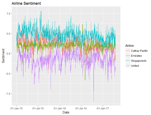
Based upon the bing sentiment algorithm, United has the poorest sentiment, and Singapore has the best sentiment. United usually has negative sentiment. Daily to day random fluctuations in sentiment make this a cluttered graph, so I decided to summarise the sentiment weekly instead of daily:
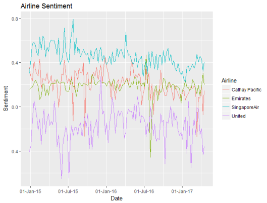
Now it’s easier to see the differences in sentiment between the four airlines. While Emirates and Cathay Pacific have similar levels of sentiment, the values for Emirates are more stable. This, however, may be due to the sheer volume of tweets about Emirates versus the smaller number of tweets about Cathay Pacific.
Step 4: Compare the Sentiment Algorithms
The sentiment scores above use the bing algorithm, but we should check whether the different algorithms produce different results.
# compare the sentiment for across the algorithms
algorithms = tweets[rep(1, nrow(tweets) * 4), c("week", "syuzhet", "Airline", "Airline")]
names(algorithms) = c("TimeStamp", "Sentiment", "Algorithm", "Airline")
algorithms$Algorithm = "syuzhet"
algorithms[seq_len(nrow(tweets)), c("TimeStamp", "Sentiment", "Airline")] = tweets[,c("TimeStamp", "syuzhet", "Airline")]
algorithms[nrow(tweets) + seq_len(nrow(tweets)), c("TimeStamp", "Sentiment", "Airline")] = tweets[,c("TimeStamp", "bing", "Airline")]
algorithms$Algorithm[nrow(tweets) + seq_len(nrow(tweets))] = "bing"
algorithms[2 * nrow(tweets) + seq_len(nrow(tweets)), c("TimeStamp", "Sentiment", "Airline")] = tweets[,c("TimeStamp", "afinn", "Airline")]
algorithms$Algorithm[2 * nrow(tweets) + seq_len(nrow(tweets))] = "afinn"
algorithms[3 * nrow(tweets) + seq_len(nrow(tweets)), c("TimeStamp", "Sentiment", "Airline")] = tweets[,c("TimeStamp", "nrc", "Airline")]
algorithms$Algorithm[3 * nrow(tweets) + seq_len(nrow(tweets))] = "nrc"

# get the algorithm averages for each airline
averages = ddply(algorithms, ~ Airline + Algorithm, summarize, ave_sentiment = mean(Sentiment))
averages$ranking = 1
for (alg in c("syuzhet", "bing", "afinn", "nrc")) averages$ranking[averages$Algorithm == alg] = 5 - rank(averages$ave_sentiment[averages$Algorithm == alg])
averages = averages[order(averages$Airline, averages$Algorithm), ]
The code above was a bit clumsy – I probably should have used reshape.
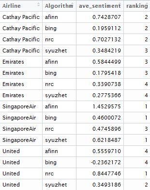
The different algorithms give similar rankings between the airlines with one big exception: the nrc algorithm is surprisingly positive about United and unusually negative about Singapore Air compared to the other algorithms. This goes to show that sentiment analysis isn’t just a plug and play technique and also means that a warning should be applied to the emotion analysis shown in Step 5 below, as it is based upon the nrc algorithm!
Step 5: Emotion Analysis
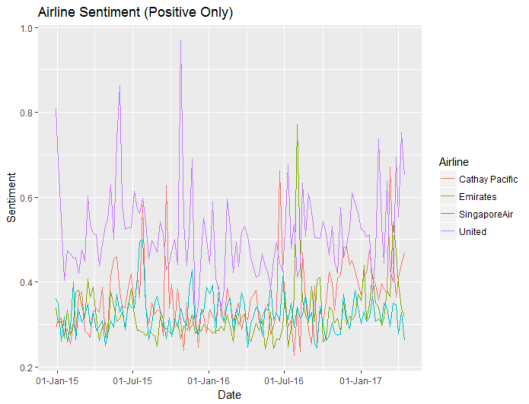
Noting the warning, from the previous section, let’s compare the emotions between the airlines and between tweets, using the nrc algorithm.
ggplot(weekly, aes(x=week, y=ave_negative, colour=Airline)) + geom_line() +
ggtitle("Airline Sentiment (Positive Only)") + xlab("Date") + ylab("Sentiment") + scale_x_date(date_labels = '%d-%b-%y')
ggplot(weekly, aes(x=week, y=ave_positive, colour=Airline)) + geom_line() +
ggtitle("Airline Sentiment (Negative Only)") + xlab("Date") + ylab("Sentiment") + scale_x_date(date_labels = '%d-%b-%y')
ggplot(weekly, aes(x=week, y=ave_anger, colour=Airline)) + geom_line() +
ggtitle("Airline Sentiment (Anger Only)") + xlab("Date") + ylab("Sentiment") + scale_x_date(date_labels = '%d-%b-%y')
# function to make the text suitable for analysis
clean.text = function(x)
{
# tolower
x = tolower(x)
# remove rt
x = gsub("rt", "", x)
# remove at
x = gsub("@\\w+", "", x)
# remove punctuation
x = gsub("[[:punct:]]", "", x)
# remove numbers
x = gsub("[[:digit:]]", "", x)
# remove links http
x = gsub("http\\w+", "", x)
# remove tabs
x = gsub("[ |\t]{2,}", "", x)
# remove blank spaces at the beginning
x = gsub("^ ", "", x)
# remove blank spaces at the end
x = gsub(" $", "", x)
return(x)
}
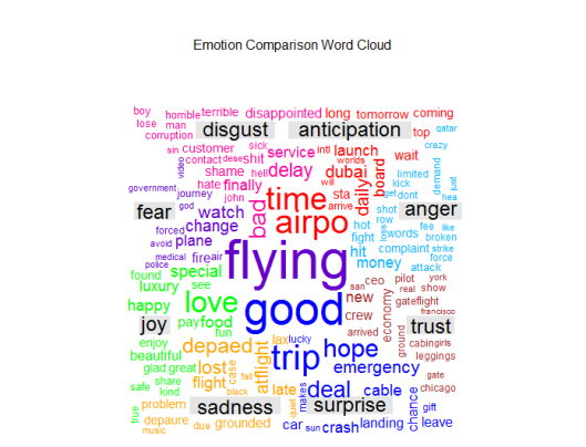
# emotion analysis: anger, anticipation, disgust, fear, joy, sadness, surprise, trust
# put everything in a single vector
all = c(
paste(tweets$Text[tweets$anger > 0], collapse=" "),
paste(tweets$Text[tweets$anticipation > 0], collapse=" "),
paste(tweets$Text[tweets$disgust > 0], collapse=" "),
paste(tweets$Text[tweets$fear > 0], collapse=" "),
paste(tweets$Text[tweets$joy > 0], collapse=" "),
paste(tweets$Text[tweets$sadness > 0], collapse=" "),
paste(tweets$Text[tweets$surprise > 0], collapse=" "),
paste(tweets$Text[tweets$trust > 0], collapse=" ")
)
# clean the text
all = clean.text(all)
# remove stop-words
# adding extra domain specific stop words
all = removeWords(all, c(stopwords("english"), 'singapore', 'singaporeair',
'emirates', 'united', 'airlines', 'unitedairlines',
'cathay', 'pacific', 'cathaypacific', 'airline',
'airlinesunited', 'emiratesemirates', 'pacifics'))
#
# create corpus
corpus = Corpus(VectorSource(all))
#
# create term-document matrix
tdm = TermDocumentMatrix(corpus)
#
# convert as matrix
tdm = as.matrix(tdm)
#
# add column names
colnames(tdm) = c('anger', 'anticipation', 'disgust', 'fear', 'joy', 'sadness', 'surprise', 'trust')
#
# Plot comparison wordcloud
layout(matrix(c(1, 2), nrow=2), heights=c(1, 4))
par(mar=rep(0, 4))
plot.new()
text(x=0.5, y=0.5, 'Emotion Comparison Word Cloud')
comparison.cloud(tdm, random.order=FALSE,
colors = c("#00B2FF", "red", "#FF0099", "#6600CC", "green", "orange", "blue", "brown"),
title.size=1.5, max.words=250)
The code above plots the emotions across time for each airline.


United Airlines attracts more angry tweets, and this has spiked in April 2017 following the David Dao incident. But United Airlines also attracts more positive tweets than the other airlines. This might explain the ranking differences between the algorithms – maybe the algorithms weight positive tweets differently to negative tweets.
Then the code creates a comparison word cloud, to show the different words in airline tweets that are associated with each emotion.
Step 6: Compare the Different Tweeting Behaviour of Different Twitter Users
Are some users more positive than others? Is this user behaviour different between the airlines? Do people who tweet more have a different sentiment to those who tweet about airlines less frequently? Are particular users dragging the average up or down? To answer these questions, I have tracked the 100 users who tweeted the most about these airlines.
# get the user summaries of the results
users = ddply(tweets, ~ Airline + UserName, summarize, num_tweets = length(positive), ave_sentiment = mean(bing),
ave_negative = mean(negative), ave_positive = mean(positive), ave_anger = mean(anger))
sizeSentiment = ddply(users, ~ num_tweets, summarize, ave_sentiment = mean(ave_sentiment),
ave_negative = mean(ave_negative), ave_positive = mean(ave_positive), ave_anger = mean(ave_anger))
sizeSentiment$num_tweets = as.numeric(sizeSentiment$num_tweets)

# plot users positive versus negative with bubble plot
cutoff = sort(users$num_tweets, decreasing = TRUE)[100]
ggplot(users[users$num_tweets > cutoff,], aes(x = ave_positive, y = ave_negative, size = num_tweets, fill = Airline)) +
geom_point(shape = 21) +
ggtitle("100 Most Prolific Tweeters About Airlines") +
labs(x = "Positive Sentiment", y = "Negative Sentiment")
#
ggplot(sizeSentiment, aes(x = num_tweets, y = ave_sentiment)) + geom_point() + stat_smooth(method = "loess", size = 1, span = 0.35) +
ggtitle("Number of Tweets versus Sentiment") + scale_x_log10() +
labs(x = "Positive Sentiment", y = "Negative Sentiment")
Firstly let’s look at the behaviour of individual users:
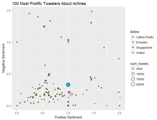
Top user sentiment is quite different by airline. Emirates has a number of frequent tweeters who are unemotional, who on average post neither positive nor negative sentiment. United Airlines attracts more emotional posts. Singapore Air and Cathay Pacific have big users that post a lot of tweets about them.
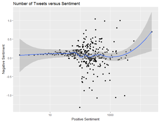
However, on average bigger frequent tweeters post a similar balance of positive and negative content to smaller users who tweet infrequently.
Step 7: Compare The Words Used to Describe Each Airline
In order to explain the differences in sentiment, we can create a word cloud that contrasts the words used in posts about each airline.
# Join texts in a vector for each company
txt1 = paste(tweets$Text[tweets$Airline == 'United'], collapse=" ")
txt2 = paste(tweets$Text[tweets$Airline == 'SingaporeAir'], collapse=" ")
txt3 = paste(tweets$Text[tweets$Airline == 'Emirates'], collapse=" ")
txt4 = paste(tweets$Text[tweets$Airline == 'Cathay Pacific'], collapse=" ")
#
# put everything in a single vector
all = c(clean.text(txt1), clean.text(txt2), clean.text(txt3), clean.text(txt4))
#
# remove stop-words
# adding extra domain specific stop words
all = removeWords(all, c(stopwords("english"), 'singapore', 'singaporeair',
'emirates', 'united', 'airlines', 'unitedairlines',
'cathay', 'pacific', 'cathaypacific', 'airline',
'airlinesunited', 'emiratesemirates', 'pacifics'))
#
# create corpus
corpus = Corpus(VectorSource(all))
#
# create term-document matrix
tdm = TermDocumentMatrix(corpus)
#
# convert as matrix
tdm = as.matrix(tdm)
#
# add column names
colnames(tdm) = c('United', 'Singapore Air', 'Emirates', 'Cathay Pacific')
#
# Plot comparison wordcloud
layout(matrix(c(1, 2), nrow=2), heights=c(1, 4))
par(mar=rep(0, 4))
plot.new()
text(x=0.5, y=0.5, 'Word Comparison by Airline')
comparison.cloud(tdm, random.order=FALSE,
colors = c("#00B2FF", "red", "#FF0099", "#6600CC"),
title.size=1.5, max.words=250)
#
# Plot commonality cloud
layout(matrix(c(1, 2), nrow=2), heights=c(1, 4))
par(mar=rep(0, 4))
plot.new()
text(x=0.5, y=0.5, 'Word Commonality by Airline')
commonality.cloud(tdm, random.order=FALSE,
colors = brewer.pal(8, "Dark2"),
title.size=1.5, max.words=250)
The code above is quite similar to that in the previous step, except that this time we are comparing airlines instead of emotions.


Emirates includes “aniston”, presumably in reference to the marketing campaign involving Jennifer Aniston, while United includes “CEO” due to a number of news stories about United CEO’s including a resignation and a heart transplant.

Pingback: Tutorial: Using R and Twitter to Analyse Consumer Sentiment | Keeping Up With The Latest Techniques
Very interesting and detailed post. I work in HR analytics and I want to start doing text and sentiment analysis. Does this package and code only work for english words or can it work for french words as well?
Thank you!
LikeLike
Hi Veronique,
These sentiment models were trained on English, so they won’t work on French text. Maybe there’s something useful for you in this post https://www.r-bloggers.com/sentiment-analysis-and-parts-of-speech-tagging-in-dutchfrenchenglishgermanspanishitalian/
Colin
LikeLike
Hi collin, it gets stuck on step 2 for me??
LikeLike
> scoreSentiment = function(tab)
+ {
+ tab$syuzhet = get_sentiment(tab$Text, method=”syuzhet”)
+ tab$bing = get_sentiment(tab$Text, method=”bing”)
+ tab$afinn = get_sentiment(tab$Text, method=”afinn”)
+ tab$nrc = get_sentiment(tab$Text, method=”nrc”)
+ emotions = get_nrc_sentiment(tab$Text)
+ n = names(emotions)
+ for (nn in n) tab[, nn] = emotions[nn]
+ return(tab)
+ }
>
> # get the sentiment scores for the tweets
> tweets = scoreSentiment(tweets)
LikeLike
nothing happens after that
LikeLike
What error messages do you get?
LikeLike
Hi Colin, There is no error. It does not show the prompt to enter commnds– It goes into limbo..
LikeLike
Sorry I can’t help you. There is insufficient info for me to know what is happening on your computer.
LikeLike
Hi Colin, I’ve been having this problem as well. After defining scoreSentiment() in step 2, when I enter “tweets = scoreSentiment(tweets)”, there is no progress, as if it’s loading indefinitely. I’ve left it on for hours with no change, and no error message in the console. The stop sign still appears. Any thoughts on what this could be, or what I might try doing differently?
LikeLike
Hi Jon,
I didn’t write the R package, so I can’t provide informed technical support. It certainly shouldn’t take that long. Maybe try to reinstall the R package from CRAN?
Colin
LikeLiked by 1 person
Hi Colin,
I just came across your post, and as your readers a year ago I got stuck when I ask my computer
tweets <- scoreSentiment(tweets)
After a few secs I get an Error message
Error in tolower(char_v) : string multibyte 72 invalid
Any cure to this computer response?
LikeLike
Hi Carlos. That sounds like an encoding problem. Have you tried converting the text to ASCII?
LikeLike
Hi Colin, Where did you use the function round_weeks?
LikeLike
Hi Mar,
That function isn’t used. Originally it was used in my visualisation section, but eventually I moved the week calculation back into the data so that it’s already in the data that you downloaded.
Colin
LikeLike
Thank you for this great example! I am able to get the sentiment plot with the daily data, but am unable to get the weekly data to work. It does not find the “Week” and thus is having difficulty proceeding. Here is the code and response.
round_weeks weekly = ddply(tweets, ~ Airline + week, summarize, num_tweets = length(positive), ave_sentiment = mean(bing),
+ ave_negative = mean(negative), ave_positive = mean(positive), ave_anger = mean(anger))
Error in FUN(X[[i]], …) : object ‘week’ not found
I tried to continue to compare the sentiments across algorithms, but “week” is involved here as well, so I could not proceed. Thanks for any advice!
LikeLike
Hi Julie,
Sorry I think that’s my fault. It looks like I accidentally dropped a line from the code I pasted in the blog. Add a line:
tweets$week = round_weeks(tweets$TimeStamp)
Colin
LikeLike
hi colin, i am doing sentiment analysis of product reviews of a particular brand. I have downloaded the data in multiple csv files. so now how should perform the sentiment analysis?? can you please suggest me..??
tweets <- searchTwitter("lakme", n=1000, lang="en", since="2017-01-01")
d_subset=twListToDF(tweets)
write.csv(d_subset,file = "beauty.csv")
Am i doing it right please suggest the correct way
LikeLike
hi colin i am doing sentiment analysis of product review data of a particular brand. I have downloaded the data in multiple csv files can you please suggest me how to do sentiment analysis on this.
tweets <- searchTwitter("lakme", n=1000, lang="en", since="2013-01-01")
d_subset=twListToDF(tweets)
write.csv(d_subset,file = "beauty6.csv")
If I am doing it wrong please suggest the right way.
LikeLike
Hi Aisha,
Please see my other blog that addresses how to use the Twitter API to get data for sentiment analysis.
Colin
LikeLike
Thank you so much. I want to have a ranking of mobile phones of different brands on the basis of tweets. I have found the sentiment of the tweets. Now can you please help me how to provide a ranking of the phones based on the tweets say which phone is the best according to the tweets of the user, which is the second best and so on. Please help me on this
LikeLiked by 1 person
All you need to do is calculate the average sentiment score for all of the tweets, grouped by each type of mobile phone.
LikeLike
Pingback: Data is the New Sage in Town: Using Sentiment Analysis to Uncover the Emotions of University Students – Learn Data Analytics!
Thank you, Colin, it was an char codification issue. You were using a Win machine, I was on a Mac. On a Win machine no problem. It was Özil, the soccer player, that mess up all.
LikeLiked by 1 person
This is an excellent post, and I wonder why nobody else has had this issue, but for me I had to load the textreg package to get the clean.text() function to work. Just in case it helps anybody else. Thanks for writing it though, it’s absolutely excellent
LikeLike
Oh how embarrassing! You define the function clean.text elsewhere. Sorry! Ignore me! It’s Friday afternoon 😉
LikeLike
Hi Colin,
How is the sentiment score calculated from the syuzhet package? What is the approach.
Thanks.
LikeLike
It implements models developed at Stanford. Some details available here: https://cran.r-project.org/web/packages/syuzhet/vignettes/syuzhet-vignette.html
I don’t know the exact details as I’m not the developer of the package.
LikeLike
Nice tutorial.
can I have your data after sentiment analysis ( i mean labeled data)>??
LikeLike
The raw data is unlabelled. You get the labelled data by running the script.
LikeLike
Thanks for your reply. I understand what you mean but do you have saved labeled dataset? It will be v helpful to me.
I will be grateful if you can share the labeled dataset. Thanks again
LikeLike
I haven’t saved a copy. Just run my script and you will get what you’re looking for.
LikeLike